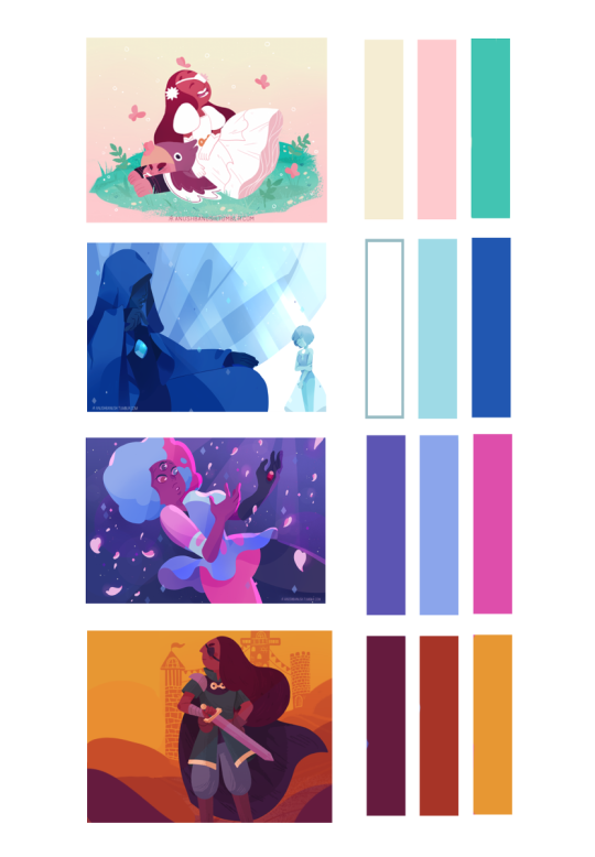
When it comes to colors, I try to pick 3 main colors. Then I make sure that my artwork revolves around these colors so that the colors won’t clash or look out of place. By doing this, I end up with one harmonious piece. Here are some examples:
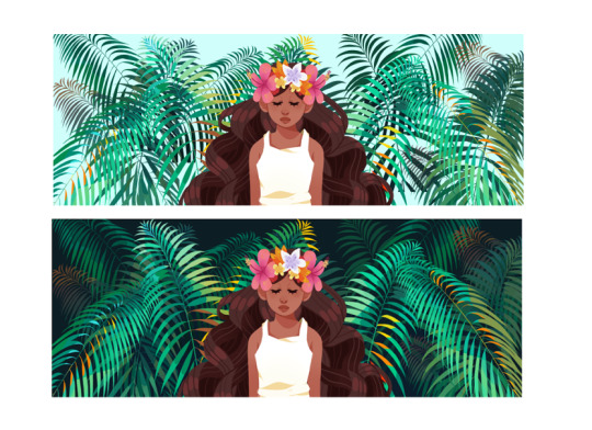
2. Using the 3 main colors, choose a good background. Backgrounds are super important because they set the mood of the piece.
Look at the impact of the background. In the first image, the light blue lessens the emphasis on the plants and allows more focus on the girl. The overall feel is nice and more summer oriented. While the second image creates an illusion which makes the leaves look like they fade out in the darkness and gives emphasis on both the leaves and the girl. The overall feel is more of a tropical forest. When choosing a background color think about how the other parts will look above that color like which part will have more emphasis and depth.
3. Match the color of the foreground to the 3 main colors and the background An example is my drawing of Steven and Connie snorkeling.
If you notice, the one with the X shows how the original colors don’t mix well while the one with the check shows how the colors are more unified.
Step 1 – Mix the original color with the desired color in order for it to match the background. Step 2 – Incorporate that color and you are done.
4. You can also search for color palettes on the internet to make you more inspired. You can learn more color combinations too.