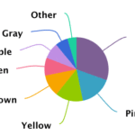
Look at this Stroop test of a pie chart. Look at it. This chart shows the results of a poll on a diamond seller’s website about people’s favorite colors of fancy diamonds. I couldn’t make a worse example of a pie chart if I tried. I could make one equally bad, but not worse. This is a massive failure of information design. Edward Tufte is shaking his head, and so am I.

Just another WordPress site
